The effect of colors on perception. Part four: color yellow


Color is one of the stronger stimuli a person reacts to. People use color to express themselves and their feelings and to expose their qualities.
Knowing how people react to colors can be very important in many aspects of life. The right color of the walls in an apartment can affect the atmosphere, and the bright color of the clothes can distinguish us from the crowd. Human reactions to different color stimuli can influence purchasing decisions and lead to increased sales. And although we can’t be sure that the reactions will always follow the pattern, the psychology of color can be useful for sales.
Yellow. Color that stimulates
This color evokes the most contradictory emotions. On the one hand, people perceive yellow as a light, joyful and sunny color, on the other hand, it symbolizes betrayal.
The yellow color expresses self-confidence. It improves mood and self-esteem.
It is also a less optimistic color because it is associated with mental disorders and madness, as well as the already mentioned betrayal and jealousy. However, it is usually perceived positively. It should be remembered that the excess of this color in the environment may cause discomfort in some people.
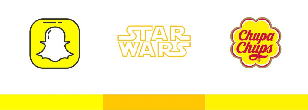
However, yellow is primarily the color of the sun, which is why we often associate it with optimism, joy and energy. It intensely stimulates and removes tiredness. It carries a large dose of positive, warm energy. It is often used in marketing to promote products aimed at young people, which is why it is often referred to as the “slack” color. Due to its positive associations, yellow is very often used in advertising. It is used in logos, banners or other elements visible to the customer.
Yellow is the brightest color of the visible spectrum.
Psychologists believe that yellow stimulates the nervous system, improves memory and sharpens the senses, making it suitable for use in the workplace. Associated with the left cerebral hemisphere, it activates our intellectual potential. The yellow color also encourages conversation. It is often used in conference rooms as it stimulates creative meetings and activities. However, not to look too far, it is worth knowing that yellow sticky notes cards are not without reason yellow…
Yellow is a color that comes straight to you.
Dr. Harry Hepner thought that yellow was the color we remember most and despise most of all – it has a visual catch. A good example is the vests and helmets used in many industries where health and safety play a leading role, traffic warning signs or New York taxis, which are easily seen on crowded streets. As the yellow color is usually bright and well noticeable, it is ideal to get attention.
It is worth noting the role of color in the world of cinema and art
Colors help to convey the story – using them properly can greatly enhance the story and the emotions of the characters. With the help of colors, you can emphasize the atmosphere of the world presented, in which the action takes place. They make us even more immersed in visual fiction. It all depends on the mutual relations between the colors in the frame.
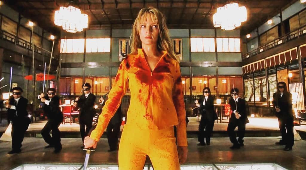
Kill Bill, directed by Quentin Tarantino, 2003
Yellow color works well as a contrast to the environment. This can be seen in Kill Bill film, in which the main character is wearing a contrasting bright yellow costume that distinguishes her from her surroundings. It’s not only about cutting the heroine a little bit off from the background (although sometimes it’s exactly that), but also about focusing more attention on her.

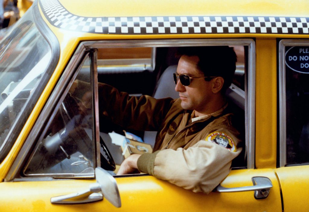
Taxi driver, directed by Martin Scorsese, 1976
The main character’s car – intensely yellow – combined with a black geometric pattern along its side, shouts to the viewer: “Attention, danger!” It recalls the coloring on wasps or the warning sign. In one of the scenes, the camera guides the viewer’s gaze at the bumper of a yellow taxi, which further enhances the feeling of physical danger.

Yellow is often considered to be golden.
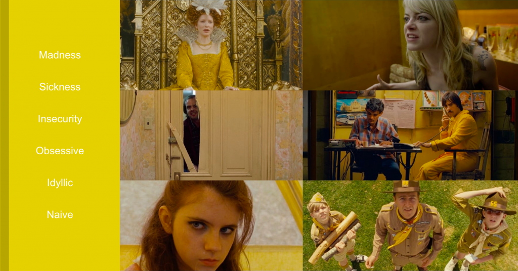
In his films, Roman Polanski uses yellow to build mood. He uses many of its broken shades, such as golden yellow – a good, bright yellow lightened to pastel – the archetype of innocence, or pale yellow – meaning betrayal or deception. It completely omits the shades symbolizing the cheerful and positive meaning of yellow.
The director in Rosemary’s Child uses a pastel shade, which is an archetype of innocence. The title Rosemary is clearly associated with this color. During the film he wears it in many variations and combinations. She sleeps on yellow sheets, uses yellow kitchen utensils, and that is what curtains in her apartment windows are like. She packs a yellow dress for hospital visit, which signals her openness, happiness and innocence, but at the same time raises anxiety about what is to happen.
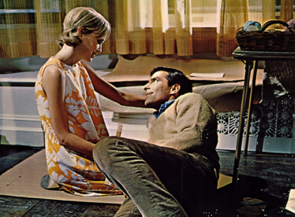

In one of the final scenes, in a pale-yellow room, everything seems to be terrifying. Polanski, building the mood of this scene, knows perfectly well that the combination of black, red and yellow, as well as the devil’s eyes, which are wrapped in red and yellow, will saturate the atmosphere with fear.
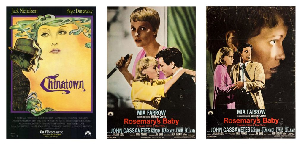
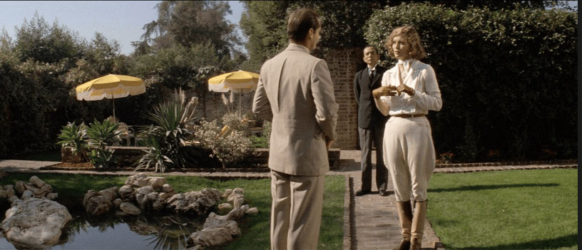
Roman Polanski uses the so-called pale-yellow key twice, first in Rosemary, then a few years later in Chinatown. He uses this color as a metaphor for innocence – pastel yellow Rosemary and Evelyn Mulwray yellow in Chinatown, which is pale and elegant. Both women in the movies are raped. The scene in which Rosemary cuts her hair for a short time is also significant. This is a symbolic scene because it reminds women who collaborated with the enemy of cutting their hair, which makes it quite significant in this film.

The intense yellow color always draws attention, can take over the stage and focus our attention.
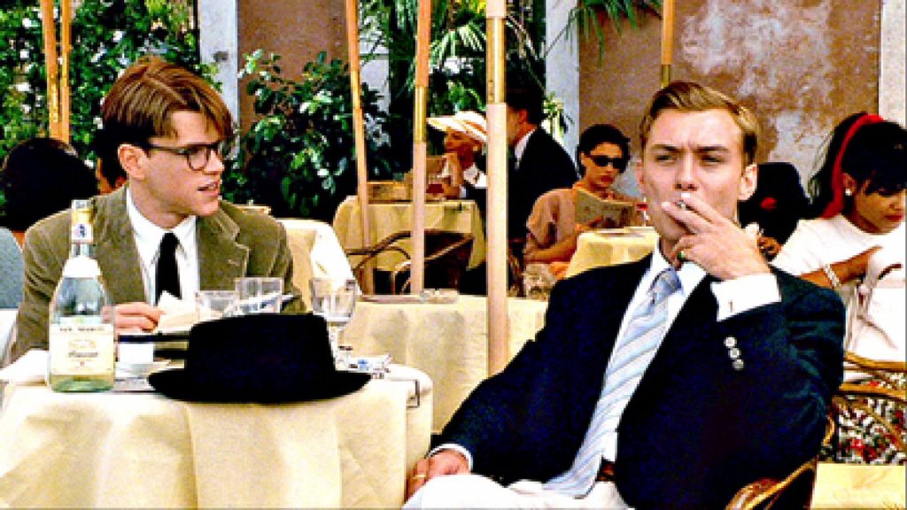
Talented Mr. Ripley, directed by Anthony Minghella, 1999
In Talented Mr. Ripley, the director uses darker shades of yellow. The honeyed world of young people on the yellow-filled Italian riviera is a good background for the climate of the whole film. The combination of shades of amber and warm gold with shades of yellow falling into light olive green generates anxiety and stress.

One thing is certain – the colors affect us.
By contacting certain colors, we easily succumb to different moods. That’s why marketing specialists effectively use the influence of colors on the recipient. We don’t usually pay much attention to analyzing the reasons why brands choose colors, but subconsciously we are “controlled” by the color used, whether we like it or not. In addition, more than 60% of people consider color to be a key factor in product selection. If color is inappropriate or discouraging, they won’t even reach for the product.
(1) Source of description: www.filmweb.pl
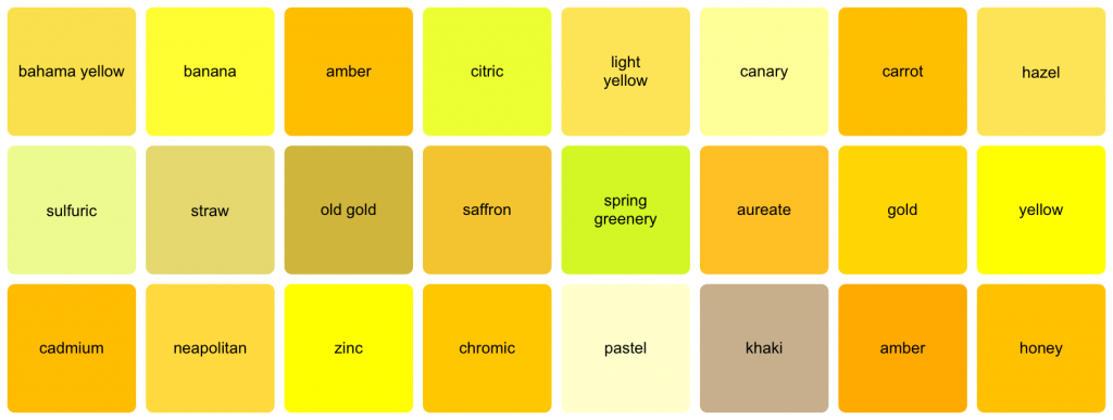
Tool used to generate color pallets: www.canva.com/color-palette/
Table of Contents