Graphic and visual arts
From graphic design to effective business presentation. Creating icons for sales application
30 Mar 2020
In our previous articles we have raised the issues of visual thinking and the role of abstraction in sales, showing the image as a universal language increasingly used in marketing and trade. Today we would like to make another contribution – iconography. An effective sales presentation must contain clear and imaginative icons.
Attractive sales presentation
How effective we are going to be in business talks is influenced by many factors. One of them is the way we visualize our message and the set of tools at our disposal to present our offer.
Traditionally, folders, leaflets, catalogues and forms are used in such cases, which the seller brings with him/her in a briefcase and gradually shows the potential customer. These materials have certain limitations – the size of the leaflet, the number of pages in the catalogue, or the capacity of the trader’s briefcase itself – all of which means that we cannot always have the tool we need with us.
It is important for a mobile salesman to present a product quickly and attractively in a way that the customer understands. More and more often, instead of a stack of papers, salespeople take with them a tablet equipped with an application tailored to the needs of a given company. Such an application may increase the effectiveness of sales presentation, which will translate into better results of salespeople.
How to design the look of our materials to optimally display them on a tablet? When designing an effective sales presentation, it is necessary to consider the legibility and aesthetics of information, which will be achieved through an appropriate selection of typography, combined with balanced graphic elements.
In the world of mobile applications, the basic means of graphic communication is undoubtedly the icon – a pictogram being a graphic representation of an idea or an object – its role and significance in the digital space we will present later in the article.
Real story of icon design
Communication by means of a picture, understood as pictographic or pictographic writing, is the oldest known writing system. Its origins date back to the second half of the IV-thousandth century B.C., when man, using simplified schematic drawings symbolizing animals, objects and people, tried to describe the world around him.

Source: https://pl.wikipedia.org/wiki/Petroglify#/media/File:Newspaper_rock.jpg
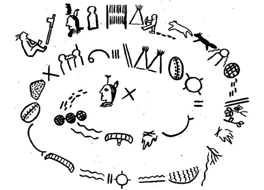
Source: http://bowieindians.tripod.com/pictogr.jpg
Nowadays, the function of pictograms has not changed – they still represent concepts by means of a graphic message detached from the verbal notation. Pictograms play an important role in visual communication. They are often used in the system of traffic signs or passenger information in metro or airport.
On large scale pictograms appeared for the first time during the 1964 Tokyo Olympics and became an integral part of the information system of the entire event.
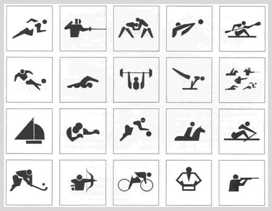
Source: https://projektowanieinformacji.blogspot.com/2010/03/olimpijskie-piktogramy.html
The contemporary role of icons
Currently, the icon functions primarily as an interactive element of the graphical interface. It is a symbol presenting e.g. a specific type of file, application, action or device, while being a link to it.
Steve Krug in his book titled “Don’t make me think” lists several important functions of icons in modern graphic interfaces.
- Icons regulate content scanning. Users do not read but scan the content of the interface for information that interests them. Icons improve readability by visually separating blocks of text.
- Icons influence aesthetics. Properly designed icons not only attract attention, but they also influence the attractiveness of the interface, diversifying it.
- Icons organize the content. They divide and categorize data so that the user can quickly find information of interest.
- Icons improve intuitiveness. A good example is the house icon as a link to the home page, or the basket icon next to the Cart.
- Icons save space. By using the icons, we can reduce the amount of text, which affects the readability and clarity of the layout.
How to design effective icons
According to Nolan Nielsen Group, one of the largest User Experience research companies, if the message that carries the icon is not unambiguous, it is just a meaningless decoration that can additionally mislead the user.
To make sure that users understand the meaning of the symbols we use, you should follow some generally accepted rules.
- The icon should be easy to find – how long does it take for the user to find the icon in the interface?
Icons are relatively small elements of interfaces, so you should remember not to put them in a maze of graphics and text that disturbs readability and makes them difficult to find. Additionally, icons should be in the same place on all screens so that the user intuitively knows where to find them.
- The icon should be understandable to users – what does the icon say without context – without text and other design elements?
Understanding the icon is based on previous user experience – as in current interfaces only some icons have a universal meaning, the rest should be equipped with short descriptions explaining their function. The set of universal icons can include burger menu, basket, heart or asterisk.

- The icon should clearly communicate what will happen when you press it – does the user understand what action it symbolizes?
The users do not always have to recognize the symbol, it is enough that they know what will happen when they press it. An example is the floppy disk symbol – an object that has long been out of use but is commonly used to mark the “Save” function.

- An icon should be visually attractive – how do users evaluate individual icons from an aesthetic point of view (do they “like” them)?
The stylistic consistency and legibility, as well as the adjustment of the size of the icons to the level of their complexity, positively influence the aesthetic impression of the recipient. Therefore, when choosing the icons, it is worth taking the time to choose the appropriate form of communication. If we are not able to design a set that satisfies us on our own, we can use ready-made solutions or the help of specialists.

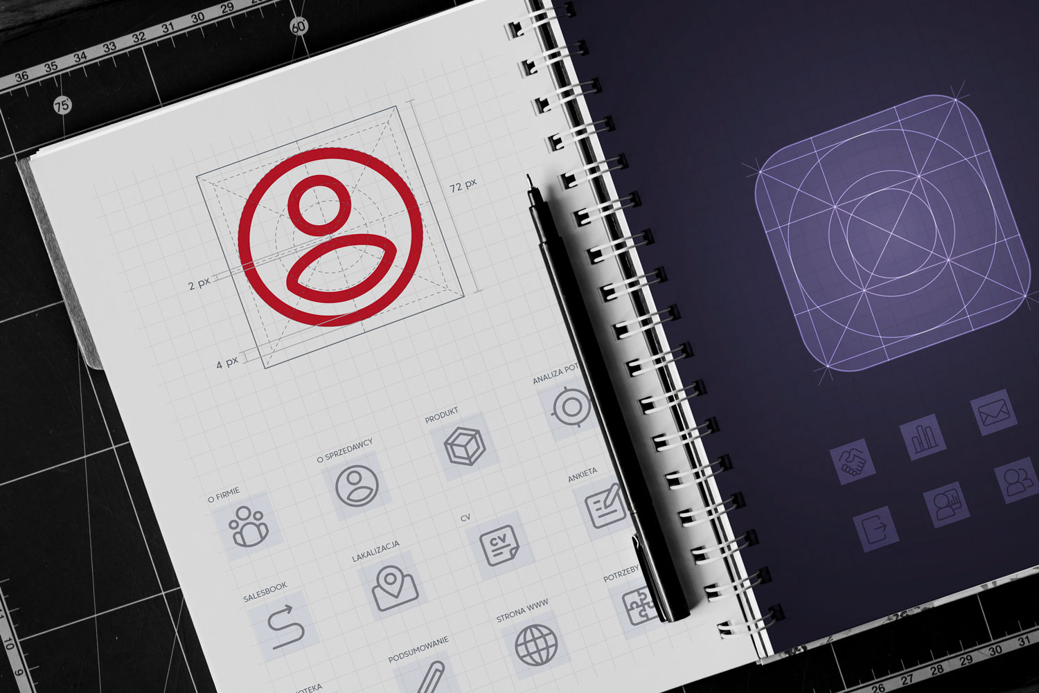
How to select icons in an effective sales presentation?
Icons should be as simple as possible. They can be flat, two-dimensional or complex, monochromatic or multi-coloured, with uniform fillings or gradients, and even the contours themselves. Whatever icons we decide on, it is worth remembering that what they should have in common is clarity and stylistic consistency.

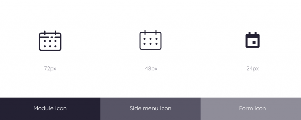
It is worth noting that the complexity of an icon depends mainly on its size.
The larger the icon is, the more elements it can consist of. That is why we distinguish three types of interactive icons in Salesbook:
- Main menu icons,
- Side menu/auxiliary menu icons,
- the form icons.
While the first two groups of icons have a similar structure and linear style, the form icons are significantly simplified and, for maximum legibility, have uniform fillings.
Interactive character of the icons
We mentioned interactive icons before – these are “clickable” icons, pressing of which will trigger the desired action. A separate group are the icons used in presentations – they have an informative and aesthetic function.
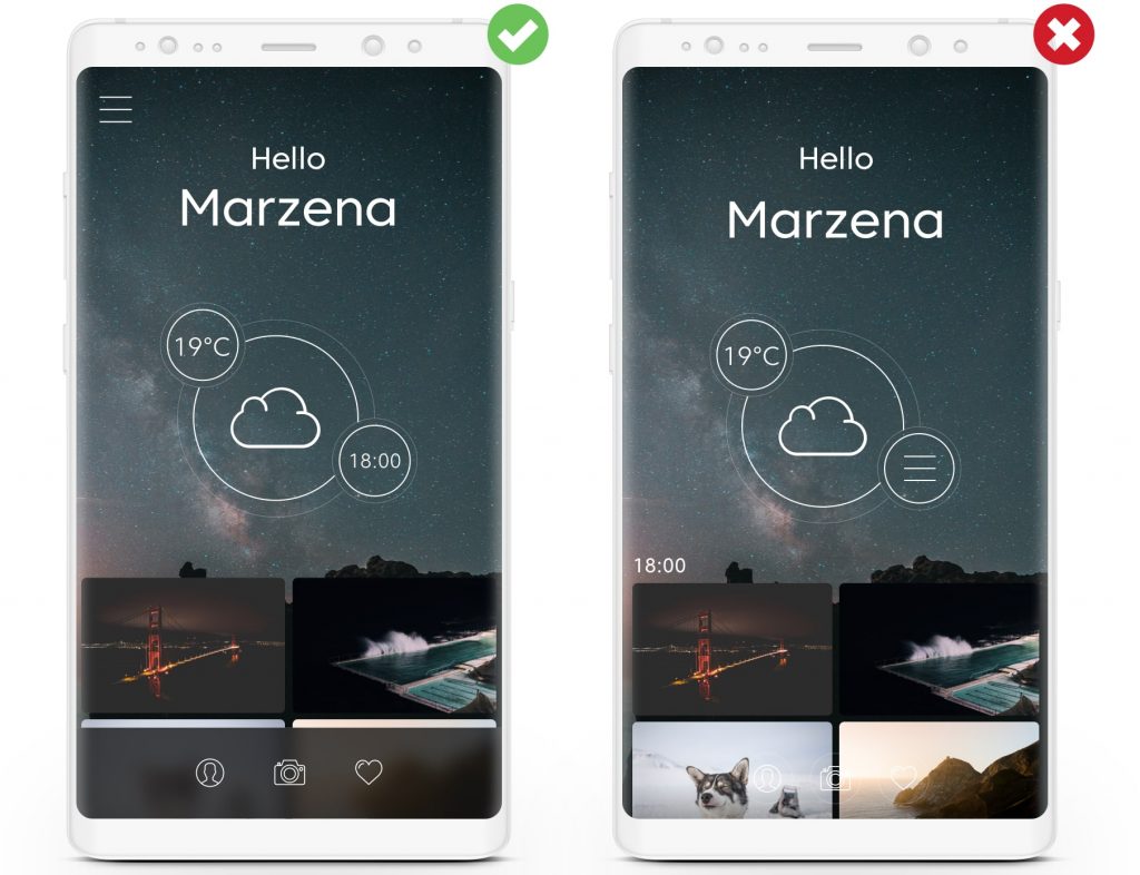
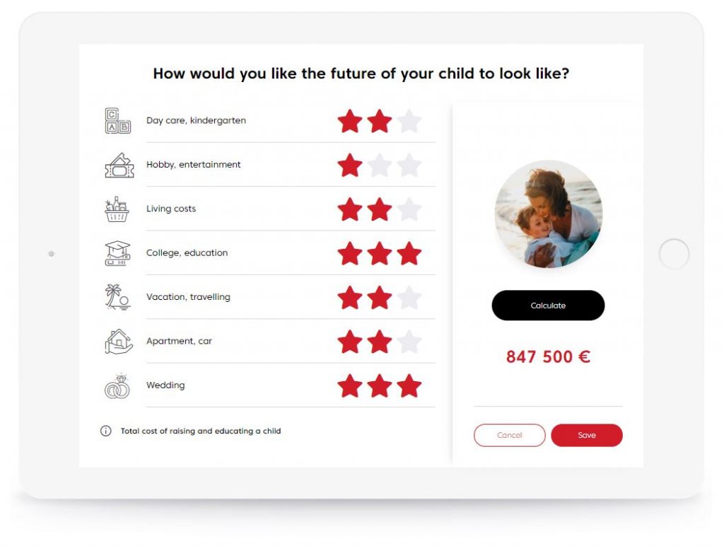
How to distinguish one from the other? Usually it is enough to use a consistent style, size or position – this is well illustrated by the screen presented below. In the first column we see icons which are visualizations of text – the nursery is presented with blocks, the wedding – with rings. All icons have a linear style and colours like the content they represent.
In the third column we see icons with a completely different style – they have a uniform, light grey filling and most importantly, they refer to the commonly known and used symbolism. What do we associate a few stars arranged in a row with? What do they mean by the name of the hotel or restaurant? They appear both in the digital and real world, so the user intuitively knows that they are a way of judging, differentiating the level of factors important to him/her.
Using icons in the Salesbook application
Icons used in the Salesbook sales application are primarily intended to make it easier for a salesman to navigate the interface, speed up finding the information he needs and make the sales process more attractive to the customer, while increasing the effectiveness of the sales conversation.
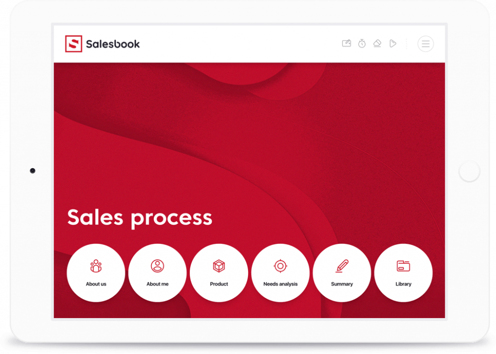
The brain recognizes graphic symbols much faster than words, so in Salesbook user can see the icons already on the main screen of the application – they are a graphical presentation of available functionalities. The main menu icons always have a description – this additional information allows novice salespeople to quickly find themselves in the application navigation process.
Colourful main menu icons undoubtedly attract attention. Their size and intense red colour suggest that they are the most important navigation element. Salesbook gives you the opportunity to import your own set of icons – depending on your company’s needs – information on how to prepare icons for the application is available in the Downloads section.
The icons of the auxiliary menu are much less obvious. They are easy to find in the top right-hand corner of the application and, most importantly, they are always in the same place, like menus on websites.
The last icon on the top bar has a circular outline and is additionally separated from the others by a small separator. The symbol of three horizontal bars in a circle, commonly called “burger menu”, suggests that after pressing it, additional options appear, available only to the merchant.
This layout is intended to introduce a hierarchy of elements and distinguish between those functionalities directly related to the sales process and those that are only relevant for the merchant.
Why do the icons increase the effectiveness of the sales presentation?
Most of the functionality of a modern computer system using the GUI – the graphical user interface – is based on interaction with the user through a system of icons. Thanks to it, users can freely use any application in a similar, intuitive way. The use of properly designed icons in combination with well selected typography will increase the attractiveness of each sales presentation.


Test Salesbook for Free
Any questions? Feel free to contact us.
+44 203 807 0179help@salesbook.com sales@salesbook.com
Our Customer Success Team is available from Mon. to Fri. 9am - 5pm CET.
We support inquiries, processes of configuration and use of Salesbook app, as well as billing and technical issues.