17 May 2019
Have you ever wondered why it is so difficult to sell financial products? Firstly, such products are often “invisible” and they have no physical manifestation. In fact, a client is holding an insurance policy, which is a few sheets of paper containing elaborate pieces of information that the client often does not understand. Secondly, no one is eager to read the insurance policy and the product itself is not attractive, because it brings no immediate benefits.
It needs to be stressed that in the 21st century taking out an insurance policy is essential if we want to provide security for the whole family; and if any doubts arise, they are usually connected with not understanding the complex nature of the product.
It is a challenge for agents to convert leads into paying clients. It therefore comes as no surprise that on average after working for a year agents become stale in a job.
Difficulties that a salesperson has to face
Everyone can work as an agent. You do not have to complete any advanced courses, you only have to get acquainted with the products and have a base of prospective clients (e.g. relatives or friends). Moreover, great patience and perseverance also prove very useful in this profession. It might seem to be easy, but it often turns out to be quite intricate. Clients do not want to meet with agents, they do not trust them, and – above all – they do not feel that they actually need a given product.
That is not surprising, because no one wants to talk about death, diseases or their current financial situation which is often far from ideal. What is more, few people are able to understand the workings of financial products.
It is worth noting that clients are not aware of their needs and, as a result, they treat the salesperson as if he were a nuisance. Therefore, they both know that they are getting nowhere fast. The agent is talking, presenting an offer, sending it by e-mail and…. there is no response. Nothing. Utter, awkward and dispiriting silence. No one wants to work, let alone make efforts to achieve any goal. The agent does not feel like making another phone call, because he knows that there is only a remote possibility that he will succeed.
What then do clients feel?
What if we were in clients’ shoes? Why do you think they avoid meeting with the agents? In fact, the sale of an insurance product is a complex process, therefore our clients often understand nothing. This problem is connected not only with the insurance market, but – in fact – with everything that involves complex and intricate structures and details.
If we take a look at headlines, we will see that insurance and financial industries trigger only negative emotions.
What are the reasons?
-
Impenetrable jargon used by the salesperson
– the salesperson uses a specific kind of language full of incomprehensible and specialized terminology:
- “saving profile – long-term, equitable”,
- “indexation”,
- “inability of a child to exist independently”,
- The pressure of time– we have only a moment to put forward our idea and lure the client, thus we have to gain his trust and convince him that he needs our product.
- Sales language– selling by means of fear, negative emotions, tragic circumstances and a worst-case scenario are the unethical techniques which in the vast majority of cases do not work, we need to bear in mind that clients want to feel safe and confident.
What are the solutions?
- Simplification of the message – what we say should be understandable for everyone, we should avoid incomprehensible terminology and we need to make use of visual tools.
- The less text, the better – let us use images, colors, numbers and charts, what we say should be universal; our client should be involved in the process of buying from its very beginning.
- Selling by means of positive emotions and dreams – our aim is to keep a promise, our client will feel appreciated, important and safe, and – as a result – we will gain his trust.
Sale process simplification
During the sale process the agent presents the financial products to the client. Unfortunately, they often have to deal with multi-page catalogues full of incomprehensible gaps and questions. We suggest shortening the process to one screen!
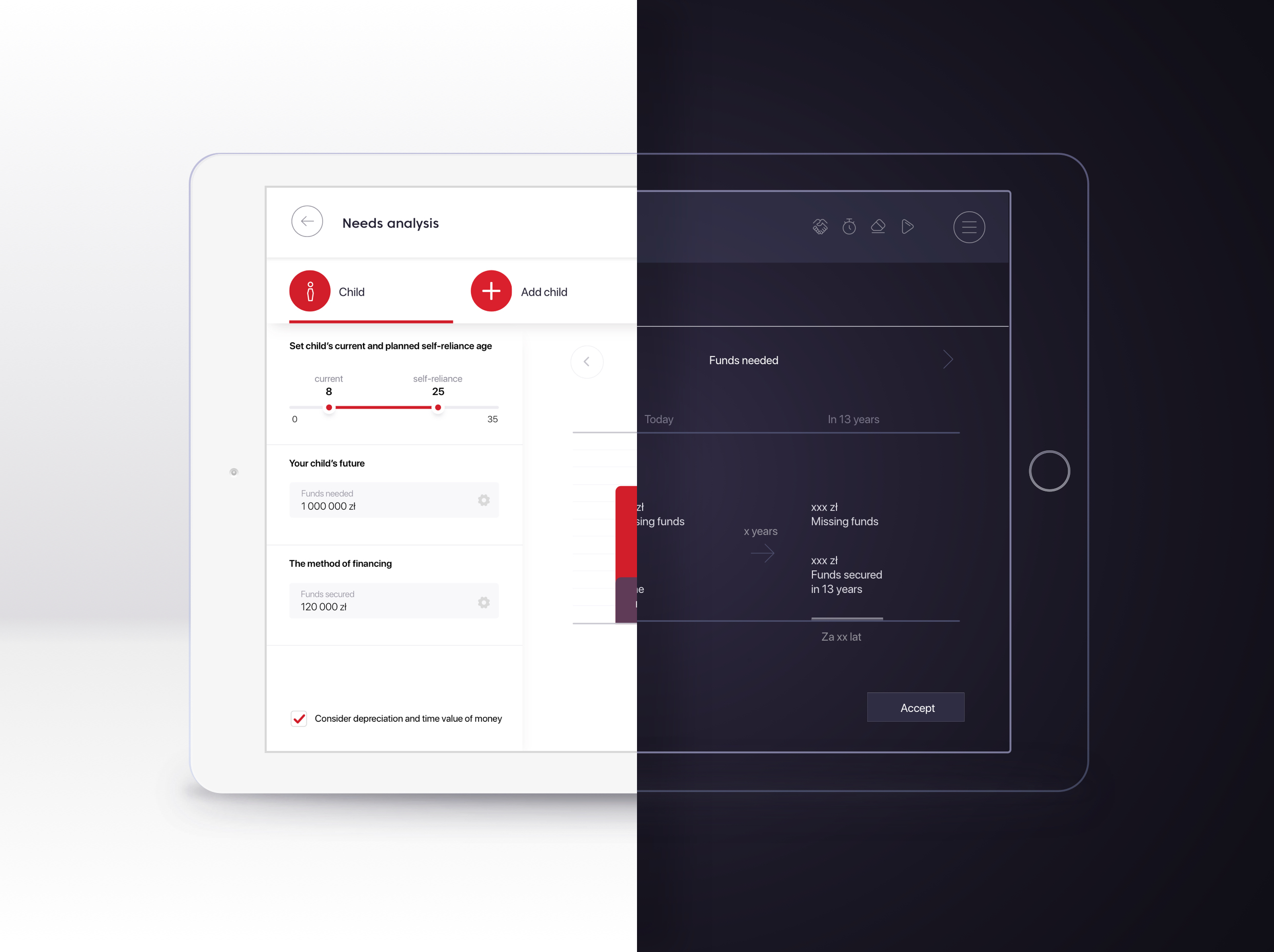
Below there is a mock up of a needs analysis concerning the costs of raising and educating children. This module may effectively replace the multi-page catalogue. When displaying the first screen of a calculator, we can see pieces of pre-collected information concerning the client’s offspring. We know that our client has an eight-year-old child, now we should ask them when the child will gain financial autonomy/independence.
The displayed screen may seem to be complete, but – as we have already mentioned – it is only a model, a project without an esthetic layer. The project’s aim is only to prove the usefulness of the presented data. Salesbook pays meticulous attention to the graphic design of the project. We are aware that such elements as typography, the color scheme and graphic elements are crucial to lure the client, because they have a subconscious effect. Salesbook analyses clients’ needs and allows us to make the clients aware of them.
Take a look at how graphic design may change the appearance of the above screen.
Show the graphic version
The screen presented above includes the same pieces of information as the model; however, this version was enriched with graphic design, color, typography and icons. White color predominates on the screen, making the impression of lightness and refinement. Simultaneously, it is a perfect background for other colors; no shade will escape our attention. Everything is readable and delicate lines separate individual sections.
In turn, red, which stresses the most significant elements on the screen, such as buttons, is the predominant color on the screen. In fact, it is the main color of Salesbook and it occurs in all graphic elements of the application, emphasizing its coherent character. Nevertheless, you may easily replace the color with one more suitable for your company. This option is available thanks to Back Office.
Hide the graphic version
Parents’ dreams
The next step is to complete the information concerning “The total amount of costs of raising and educating a child”. You can ask your client how much money they are going to invest in this. However, it may turn out that the client is not aware of the costs associated with the upbringing of the child.
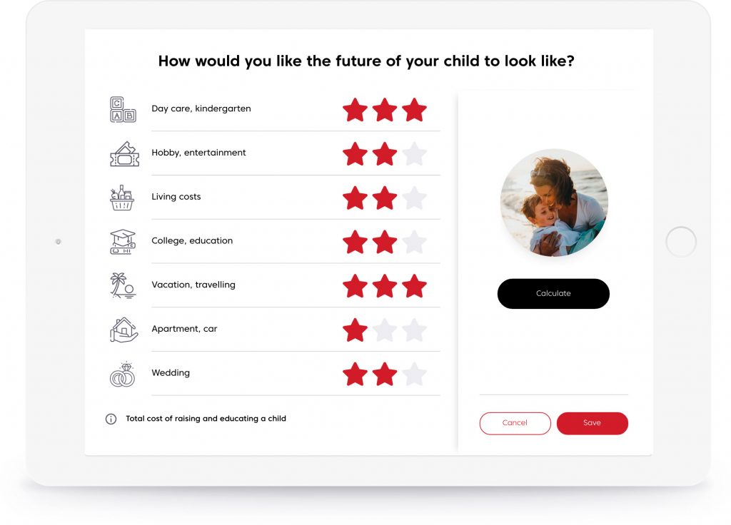
What we need to do is to indicate the areas on which parents should focus: day care, kindergarten/Hobby, entertainment/living costs/College, education/Vacation, travelling/Apartment, car/Wedding. We may show the choices in purely textual form, but is it not more appealing when we present it in the following way:

Let us go one step further and use the symbols understandable for everyone.
There are the icons and the text, but are they enough? Probably most of you are not satisfied. And rightly so, because our aim was to choose drawings/graphics incoherent with what they were supposed to illustrate. In fact, it is still the model, even though a more advanced one.
To be fully professional, we would have to check the universality of the icons and see if they are understandable for everyone. There are a number of the research tools which enable us to check and opt for the most appropriate icons, however, now we will move on another issue.
To see how the set of icons may visually change the appearance of the screen, click here:
Show the graphic version
We can see the same set of information, but this time the icons were chosen so as to clearly illustrate the notions they refer to. As a result, there are blocks with letters – essential for every pre-schooler, tickets to the cinema – a popular symbol of entertainment, or an exotic island – a popular vacation destination.
Additionally, all icons were designed in the same style, hence the impression that they are consistent.
Hide the graphic version
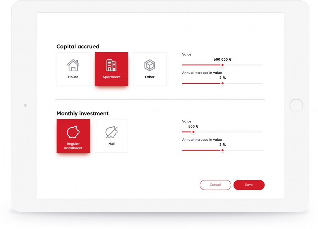
Let us move forward, the areas we identified (day care, costs of living, education, apartment, etc.) may be secured by parents on three financial levels: basic, moderate and premium. The majority of forms, which must be filled in by salespeople, are similar to the one below. We can see both a need and a level that the parents want to secure. All you need to do is to click one option:

A product devoid of any esthetic qualities will not lure the clients. Esthetics has a substantial influence on how the company is perceived by a prospective client. In other words, would we allow our representative to wear stained pants or a shirt that wasn’t ironed? If his appearance is the trademark of the company, then is it not the appearance of the materials he works with that subconsciously influences on the client’s decisions?
To see how the element in question may look like, click here:
Show the graphic version

We may add a graphic layout to the above element and choose the icon from the set. The layout with the icon inserted on the left side of the text is used in the majority of applications.
In order to determine the level of security, we will use universal symbols and a graded scale of three stars according to which one star indicates the lowest grade and three stars indicate the highest one. The application of such an arrangement and two different styles provides us with a clear-cut division into the visual-content icons and the function icons.
Hide the graphic version
Now we can move on to another question: At which level can you plan your children’s future? We need to allow our client to determine and click the needs they prioritize. As a result, they become part of the sales process. Not only do they become aware of their needs, but they are also involved in the discussion and make conscious choices.
In all likelihood, the client will become more engaged in the discussion. Some will focus on education, whereas others will pay attention to sport and hobby. A number of clients will say that to buy a house you need to work hard on your own, but there will be a group of parents who would like to help their children and invest some money in their future. Our aim is to find out what our client wants not necessarily by asking questions.
To make the client aware of their needs is usually a tedious process which, in fact, may be easily improved! We want to stress that the above screen presents only the structure of the necessary information. On the left there is the complete list of the already defined “areas” and three options that allow us to choose the level of security. In turn, on the right you may find the button “Calculate” which allows you to change the level of security if the amount of money is too high or too low.
By adding color, typography and graphics we may considerably change the appearance of the screen.
Show the graphic version
Above you can see our graphic presentation of the product. The bold headline is the first thing that draws our attention. Other pieces of texts are smaller, but the left-side arrangement suggests the order in which we should submit data.
The button “Calculate” allows us to calculate the amount of money needed to secure your child’s future at the level the client is interested in.
Apart from typography, icons and the use of colors discussed above, there is also a picture of a happy parent with a child on the screen. The photo is a suggestion, because every parent wants their child to have the best future.
Hide the graphic version
Parents’ efforts
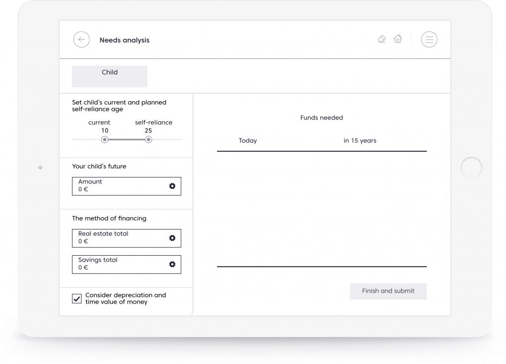
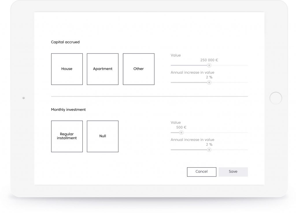
Once the level of financial needs of our clients has been determined, we can ask them if they have done anything to secure their child’s future. Once again we can ask our client to enter the amount of security, but are we sure that this is the best way? We help our clients to visualise their savings.
Let us present the areas that our client may be interested in. There are two options: real-estate investment (e.g. apartment, house) and regular saving money.
Once we establish the arrangement of the elements, we can move on to the graphic layer.
Show the graphic version
Diverse typography and the predominant color allow the client to use the form without difficulties. They are aware of all his choices.
Hide the graphic version
It may be easier to sell financial products!
We have shown how to change an ordinary questionnaire used by an insurance agent into a readable, clear and visually attractive process of needs analysis. As a result, our client is satisfied because they become part of the selling process and our company is perceived as professional.
A few simple steps enable us to determine what parents wish for their children and whether there are real chances to achieve their goal. If the client is satisfied, we are satisfied too.
Most importantly, the client knows that we want to help them to secure their child’s future. Both sides are satisfied, because the salesperson and the company do not want to overestimate the client’s possibilities.
What else can we do? We shall explain additional options.
Real-world needs analysis
Does it work in the real world? Is it really important to pay attention to details, such as adequately selected colors, graphics or typography? And, finally, what will the analysis of my needs look like?
To answer these questions click the online calculator. It is available in the graphic version presented in this article, you may also find its informative version without the esthetic layout.


Test Salesbook for Free
Any questions? Feel free to contact us.
+44 203 807 0179help@salesbook.com sales@salesbook.com
Our Customer Success Team is available from Mon. to Fri. 9am - 5pm CET.
We support inquiries, processes of configuration and use of Salesbook app, as well as billing and technical issues.